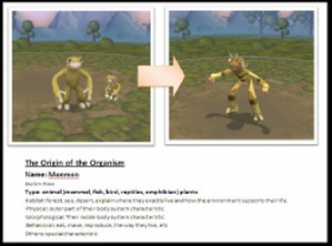
Below is the presentation that I use to present this to year 5 students who learn about Children Rights and they would like to create poster to raise people awareness toward this issue. I also include some tips when you decide to create poster as media of presenting your thought and idea below the slide.
1. Making it visual, verbal and both
When you start planning your poster, decide whether you want your poster to be mainly visual with image or picture dominating the poster, or maybe you want to give more information by having more text instead of image. However you can have both, but you need to carefully design the layout.
2. Using shapes and forms creativelyShapes and forms are the main elements of design, therefore you have to use them creatively. Use geometric and non geometric shapes and forms. Using forms creatively will attract more audience.
3. Making meaning with color
Color have lots of meaning. In a study about visual communication, every color that you choose to be applied in the design will give different meaning to the poster. When you want to express sadness and intensity you might use dark and gloom colors. On the contrary, red and yellow might respresent joyful and happy feelings.
4. Guiding audience with the line
You might use the implied lines to guide audience eyes to see the main message of image of the picture. When you design this carefully, you will have effective poster which will attract audience more.
5. Creating proportionProportion is important. You don't want your poster out of proportion. Proportion doesn't mean always the balance between left to right or up and down. Even the object is small in one side and big in the other side but if they are placed properly based on proportion then it will make the design look proportional.
6. Balancing your design
there are 2 types of balance: symmetrical is where the design is exactly balance between two sides whether in color, shapes, or forms. Another type is asymmetrical balance where two sides doesn't always the same forms, shapes, lines, texture. By playing with these elements you can have the balance.
7. Less is More
You don't need to have complicated design with so many elements in it. One simple idea with simple element in it will improve the message of the poster. However, you need to have careful thought on putting meaning to this kind of design.


 RSS Feed
